The following is a guest post from a Data Innovation Day partner. This article was originally posted on #WETHEDATA.
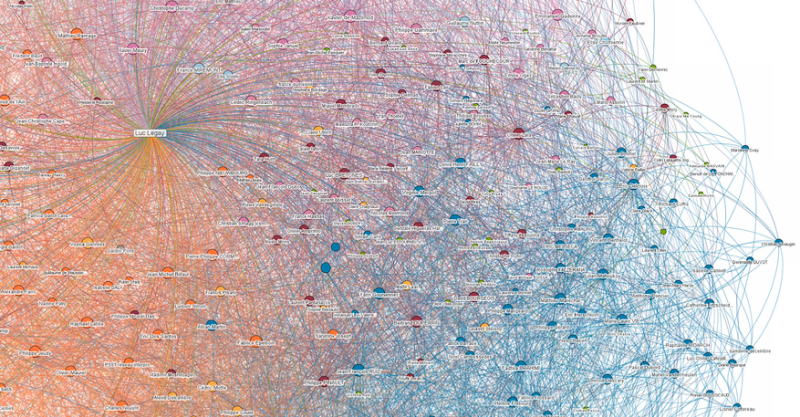
The emerging field of “data visualization” brings together quantitative information with technology and graphic design to tell stories and convey ideas. As data about our environment, travel, work, online activities and other behavior increases exponentially, visualization tools can help discern the forest from the trees of rows and columns, in order to understand trends and make decisions. Moving beyond the standard pie charts and bar graphs, creative visual artists, demographers, journalists and others are developing exciting new ways to marry data with visual representation.
“Creative visual artists, demographers, journalists and others are developing exciting new ways to marry data with visual representation.”
These pictographs draw on a variety of data sources, ranging from large, publicly available datasets to user- or community-generated reports to very individualized information meant for personal consumption. Public datasets on any number of topics are now online through the Open Government Platforms in the United States and elsewhere. Health department restaurant ratings, immigration statistics, birth-name registries and much more are being made available at the national, state and local level. Apps based on these datasets are being created weekly in hackathons around the world and by professional data scientists. Global development statistics, for one, received a breath of life with Gapminder, a tool created by Swedish statistician Hans Rösling in 2005. His dynamic, multidimensional tool revolutionized the presentation of UN data with its compelling, interactive demonstration of the relationship between per-capita income and life expectancy in 190 countries over the course of two centuries.
Individuals may contribute to public repositories of data regarding a particular topic or event. The crowd-sourced mapping platform Ushahidi was developed in 2008, in the wake of post-election violence in Kenya. Its combination of SMS reports and online mapping helped document areas of violence for journalists, government leaders, and concerned citizens in Africa and around the world. Since then, the Ushahidi platform has been used in other crisis situations (most recently in Libya andSyria), as well as for collective mapping of areas affected by natural disasters and extreme weather.
Visualization tools are also being developed at the personal consumer level. For committed Facebook users, Wolfram Alpha creates visualizations of individual Facebook accounts, including online activity, demographics of friends, connections among them, and more. Using data from his cellphone provider, a German journalist created an extensive time-series map of his whereabouts over a year. Individuals are gaining access to ever greater details about their own bodies, including genetic makeup and other biostatistics, and new tools are being developed to track personal information and activity, building on the growing trend of the “quantified self.”
The purpose of visual representations ranges from the utilitarian to the whimsical. They can serve a documentary purpose for disaster response or crisis intervention, as in the Ushahidi examples above. Like any rhetorical tool, data visualizations can also be used to persuade and it pays to be skeptical, as representations can be misleading: even if the data are true, what story does it tell? A typical map of the 2012 U.S. electoral results presents a correct but skewed view since geographic boundaries do not reflect population size. Montana is one of the largest states geographically but represents fewer than 500,000 voters, while California, of comparable square mileage, has 18 million. A more authentic representation might adjust the size of the state to match its population, as Mark Newman has done in a set of maps found here and below.
Some of the most interesting visualizations are simply beautiful representations of data with no agenda other than illustrating the creativity of the designer and sparking joy and imagination in the viewer. Fernanda Viégas and Martin Wattenberg’s wind maps use surface wind data to illustrate streaming patterns in beautiful black-and-white maps that look like wind blowing through tousled hair or lush fields of grass. Aaron Koblin’s Flight Patterns, based on FAA flight data, shows the constellations of airline hubs and flights across the United States. Next month, in a collaboration with Viégas and Wattenberg, UC Berkeley’s Ken Goldberg and Sanjay Krishnan will debut Bloom, an Internet-based artwork that draws live seismologic data from the Hayward Fault to generate a field of expanding circular blooms based on wildflower colors.
These are sophisticated examples, but developers are also working on DIY tools that democratize the use of data. The Facebook analytic tool above is one example, and Google offers a toolkit as well. The set of data visualization tools developed by Viégas and Wattenberg at IBM, Many Eyes, offers a fun sandbox to explore applications using existing datasets or those contributed by the user. For inspiration, amateurs and professionals alike can look to the work of pioneer Edward Tufte, whose booksBeautiful Evidence and The Visual Display of Quantitative Information have become classics.
The flexibility and power of data visualization highlights the growing need for data literacy. Just as Mark Twain denounced “lies, damn lies, and statistics,” pictures of statistics can reveal or distort. The more users know about how data is gathered, analyzed, and presented, the more informed—or delighted—we can be. It pays for all of us called to make decisions, whether about public policy questions or our own behavior, to understand the magic behind the mirrors.
Image credit: Flickr user luc legay
—
Dr. Camille Crittenden is the Executive Director of Data and Democracy, CITRIS @ Berkeley


