
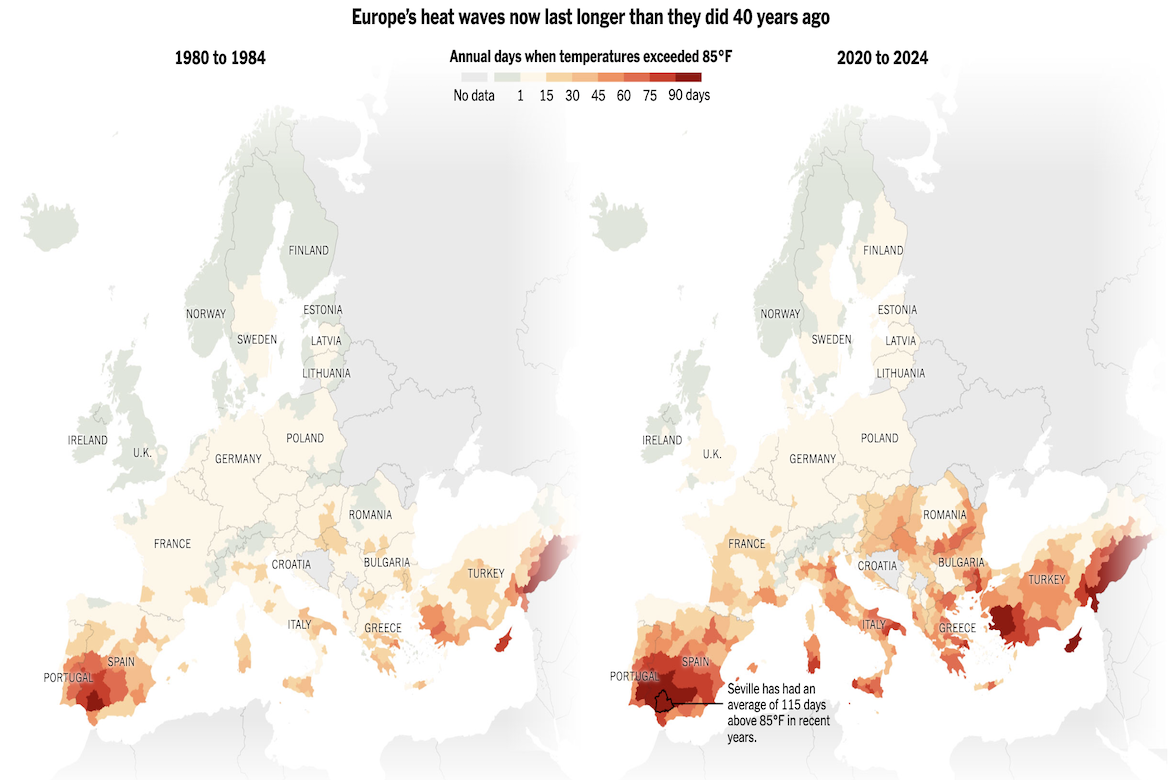
Climate data from Copernicus, the European Union’s Earth observation program, show that much of Europe now experiences far more days above 85 degrees Fahrenheit than it did forty years ago. The map compares 1980–1984 to 2020–2024, shading each EU subregion by the average annual number of hot days: pale yellow for 1 to 15, deep orange for 45 to 60, and dark red for more than 90. The visualization reveals widespread increases, especially in southern Europe, where Seville has averaged 115 such days in recent years and Madrid’s count has more than doubled to 63. The color gradations make it clear how extreme heat has intensified and spread, reshaping summers and fueling debates over adaptation measures like air-conditioning.
Visualizing Progression of Heat Waves in Europe
previous post