
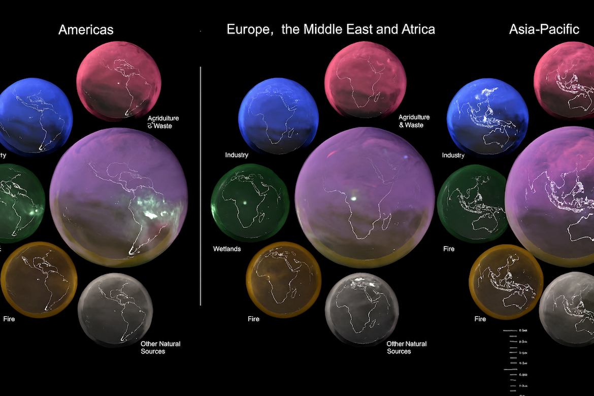
NASA has released a new global visualization of atmospheric methane for 2021, using advanced computer modeling. The globe is first divided into three regional views—Americas, Europe–Middle East–Africa, and Asia–Pacific. Within each region, five maps show methane from distinct sources: agriculture and waste (fuchsia), industry (blue), wetlands (green), wildfires and cropland fires (yellow), and other natural sources (gray). These five maps are then combined into a larger composite globe that overlays the sources, revealing how emissions mix and move as winds circulate. Industrial methane remains steady and clustered near cities, while natural sources vary seasonally—for example, Amazon wetlands slow methane release during the July–August dry season just as South American fires intensify. This layered view helps scientists separate human-driven and natural contributions, deepening understanding of methane’s role in climate change.
Visualizing Global Methane
previous post