
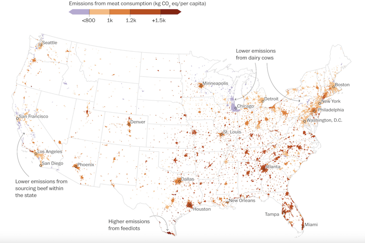
The Washington Post has created a visualization using data from a new Nature Climate Change study that maps the emissions from beef, pork, and chicken consumption—called the carbon “hoofprint”—across nearly every continental U.S. city. The map’s color gradient ranges from purple (lower emissions, under 800 kilograms of CO₂ per person) to deep red (higher emissions, above 1,500 kilograms). Areas around Milwaukee and Chicago appear in lighter shades because their beef often comes from nearby dairy cows that produce fewer emissions. In contrast, red regions across Texas, Oklahoma, and the Southeast represent places where large-scale meat production and waste storage release more methane. The study found that replacing half of one’s beef intake with chicken, cutting food waste, and observing Meatless Mondays could together reduce emissions by more than 50 percent, while improved feed and grazing practices could further lower emissions in the highest-impact areas.
Assessing Emissions from Meat Consumption Across the U.S.
previous post