
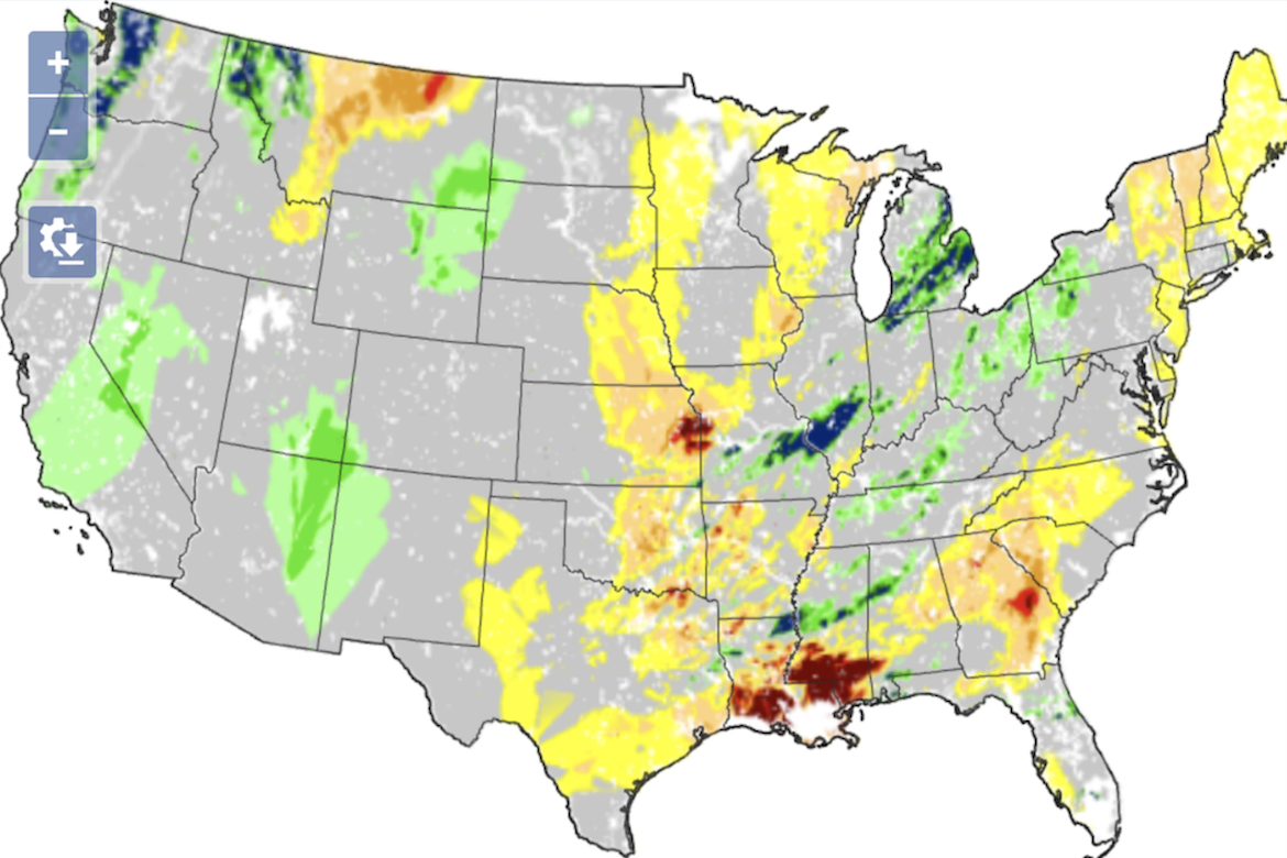
The National Soil Moisture Project, led by a team of researchers across U.S. government agencies and academic institutions, has created a visualization mapping daily soil moisture levels across the United States. The map uses a color gradient from dark red (extremely dry) to dark green and blue (exceptionally wet) to show current moisture conditions at a depth of twenty centimeters. Updated daily, the visualization compares present soil moisture levels to historical averages dating back to 2018, highlighting areas experiencing unusually dry or saturated conditions. The map helps researchers, farmers, and policymakers monitor drought, flood, and agricultural trends nationwide.
Visualizing Soil Moisture Levels
previous post