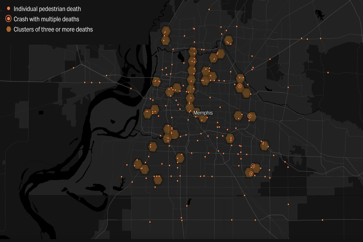
The Washington Post has mapped where drivers have struck and killed pedestrians in Memphis from 2021 to 2023. The map shows each death as an orange point on a darkened city grid and uses larger amber hexagons to mark places where fatalities cluster, with each hexagon growing as more people die in that area. The project draws on the federal Fatality Analysis Reporting System, which records crash coordinates, road features, lighting, vehicle details, and demographic information. The visualization shows fatalities clustering most heavily along a single north–south arterial corridor, where dozens of deaths stack into a continuous band.
Mapping Dangerous Intersections