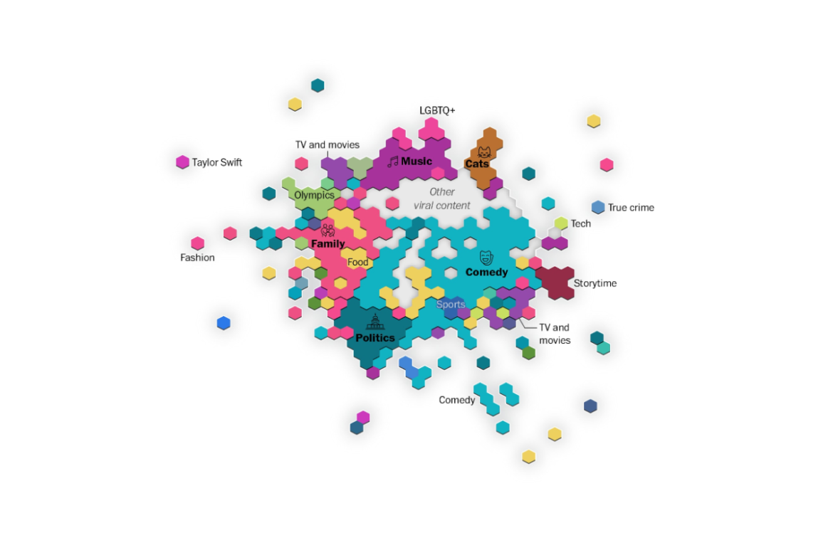
Data analysts at The Washington Post have created a visualization that illustrates how TikTok’s recommendation system organizes content based on user exposure. The team analyzed 121,000 videos from the watch histories of 1,100 users and used mathematical models to learn which videos tend to be shown to the same audiences. They then projected those relationships into a two-dimensional space and grouped the results into hexagonal regions that summarize where content clusters and how dense those regions are. The resulting map shows categories, like comedy, as large and sprawling because they appeal to many different users, while more niche interests, such as fashion, appear as smaller, more isolated pockets. Distance on the map reflects how easily users move between topics: jumping from comedy to family content is common, while leaping from cats to politics is far less likely, and highly polarizing fandoms, such as Taylor Swift content, form their own islands, largely disconnected from the rest of the platform.
Mapping How Tiktok’s Algorithm Recommends Videos