
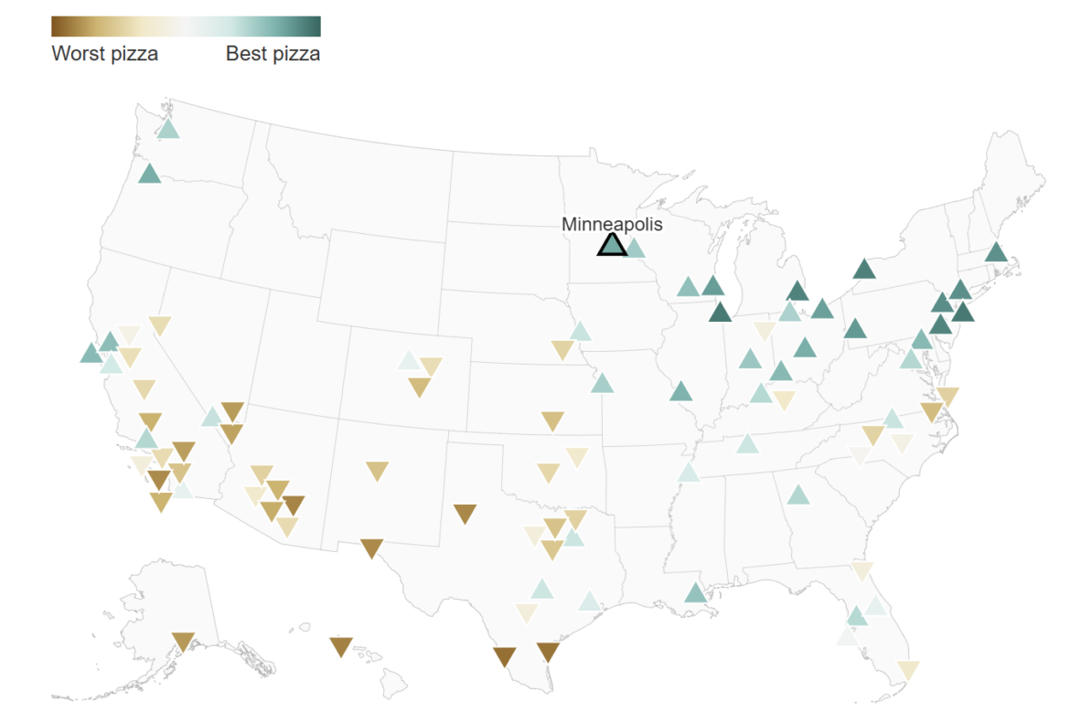
The Washington Post has published a series of visuals examining how ChatGPT comparatively ranks states, cities, and countries across subjective traits like friendliness, honesty, beauty, laziness, and even pizza quality. The data comes from an academic study in which researchers asked the chatbot millions of head-to-head questions, forcing it to choose between two places at a time. Repeating this across hundreds of locations produced ranked maps that reflect the model’s learned associations. The visualizations show that these patterns often align with widely circulated cultural narratives, such as Chicago and New York topping the “best pizza” rankings, alongside more consequential comparisons about which states are lazier or which countries are smarter, making visible how these associations can surface at scale in AI-generated comparisons.
Mapping ChatGPT’s Comparisons of Places
previous post