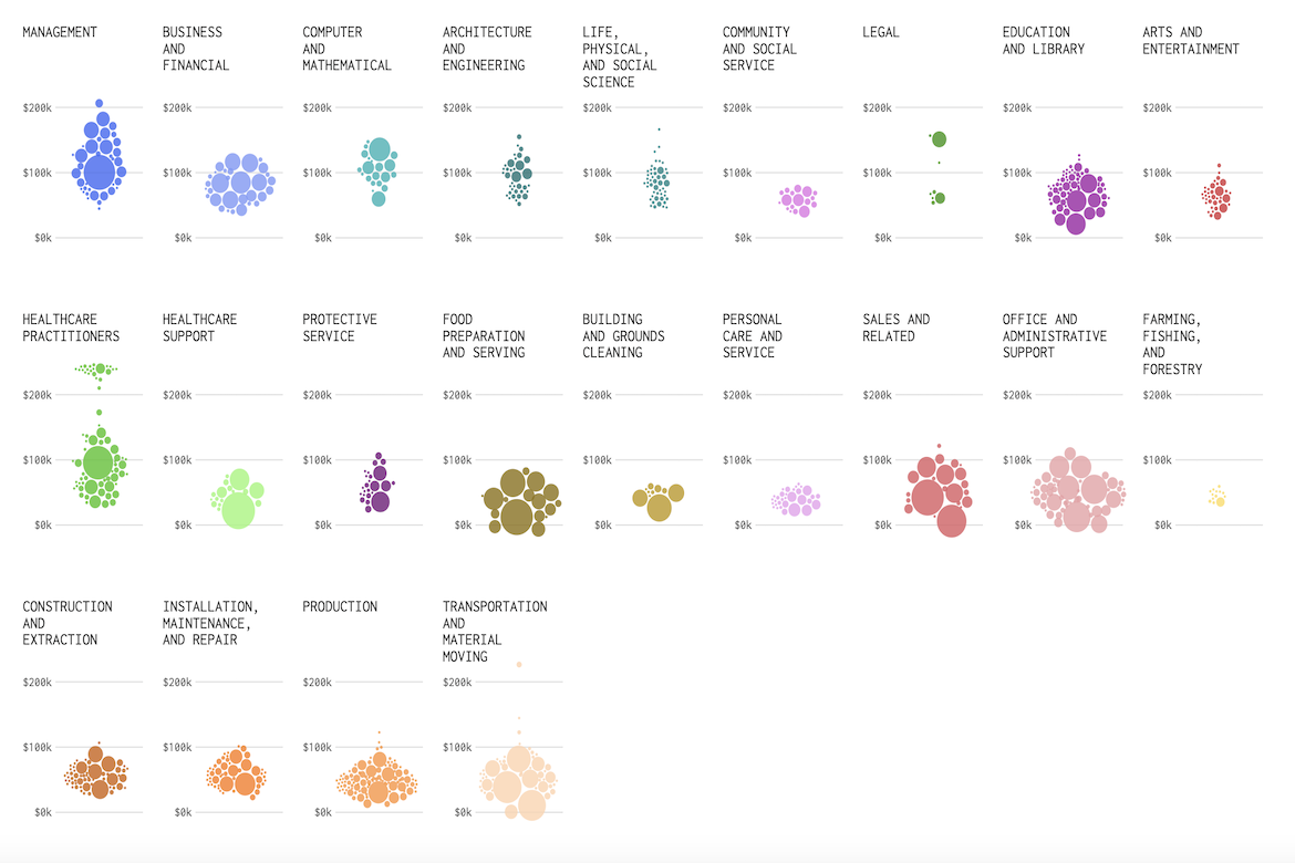
The Washington Post has created a visualization using Bureau of Labor Statistics data to show how salaries vary within and across U.S. occupations. Each cluster of circles represents a job category, such as healthcare practitioners, with positions within that role, such as pharmacy technicians and registered nurses, sized by number of workers and spread vertically by median salary and horizontally by the range between the 25th and 75th percentile. The chart reveals striking contrasts: some occupation areas, like management, legal, and healthcare practitioners, show wide gaps between the lowest- and highest-paid roles, while others, like personal care and service, building and grounds cleaning, and healthcare support are tightly clustered.
Visualizing Distribution of Jobs and Income
previous post

