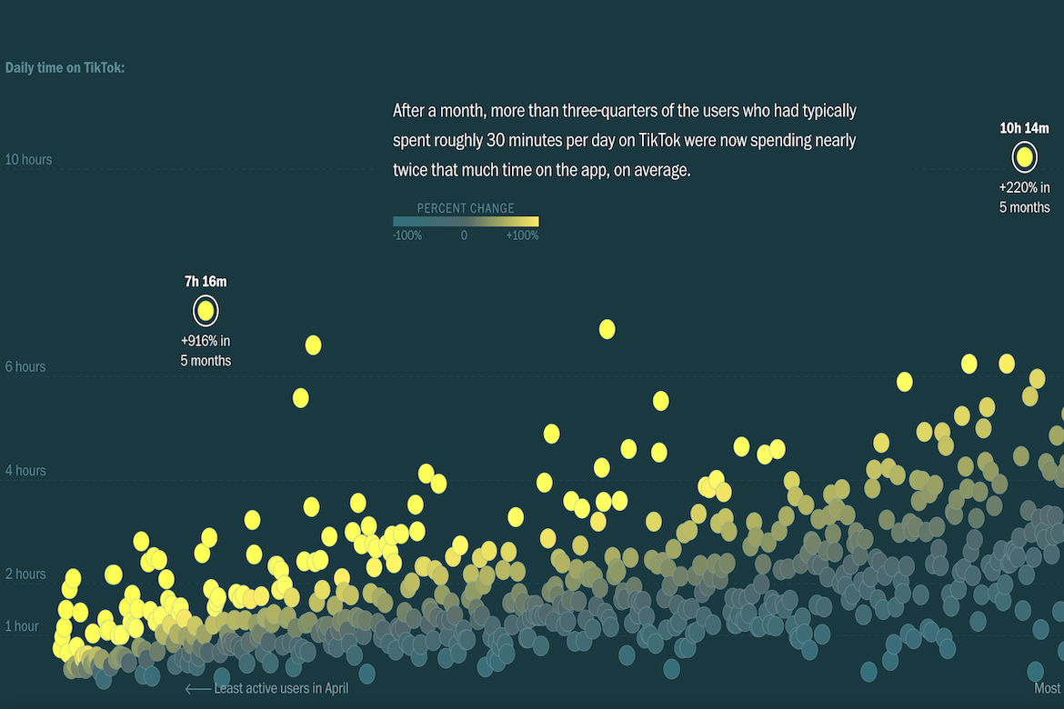
The Washington Post has created a visualization showing how 800 U.S. participants’ average daily screen time on TikTok changed over five months. Each dot represents a single user, plotted by how many hours they spent on the app per day (y-axis). The x-axis shows users from least to most active at the start of the study, allowing changes in behavior to be compared over time. The color of each dot indicates the percent change in usage—cooler tones showing little or no change, and brighter yellow tones showing large increases. The visualization shows that occasional users saw the steepest increases in screen time over five months, while heavier users remained relatively stable.
Analyzing TikTok Usage
previous post

