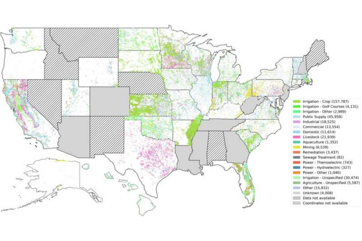
Researchers at Virginia Tech created a map that shows how states differ in water use across farming, manufacturing, and power generation, from crop irrigation to power-plant cooling. Working with all 50 state water agencies, the team standardized a century of groundwater and surface-water records into a consistent format, even as some states provided uneven historical data. The map displays irrigation in green, industrial use in purple, and mining in yellow.
Visualizing Nationwide Water Usage
previous post

