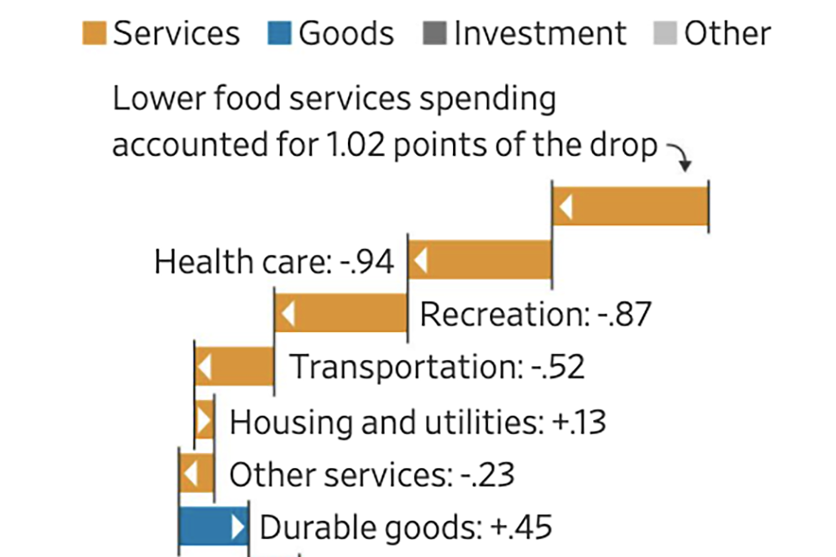
The Wall Street Journal created a series of graphs to illustrate the largest economic decline of the United States since the Second World War. One graph shows how spending on services such as transportation and recreation accounted for drops in the economy, while spending on goods such as foods and beverages contributed to increases in the economy. Another graph shows that between 2019 and 2020, the gross domestic product decreased by 3.5 percent, the first decrease since 2009.
Visualizing Changes to the U.S. Economy in 2020
previous post

