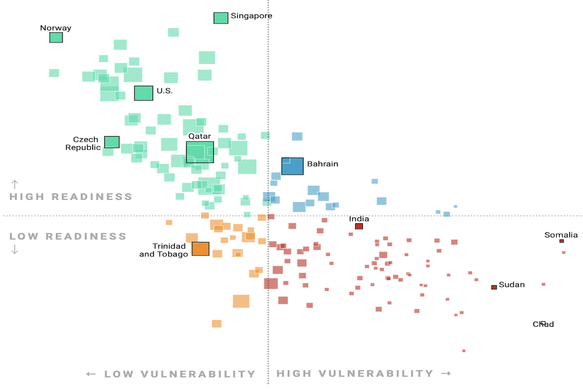
Datawrapper, a data visualization creation company based in Germany, has created a visualization comparing countries’ risks from climate change. The visualization contains a horizontal axis representing countries’ vulnerability and a vertical axis representing countries’ readiness. It places each country into a quadrant and displays a correlating color for that quadrant. The size of each country’s box represents its carbon dioxide emissions per capita, with larger boxes representing higher emissions. According to the visualization, most of the countries facing the worst risks from climate change are the least responsible for carbon emissions.

