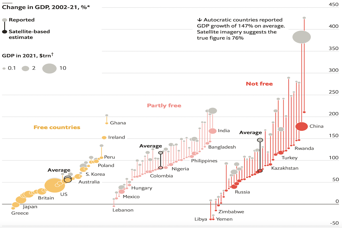
The Economist has created a visualization illustrating irregularities in dictatorships’ reported economic growth. The visualization groups countries by the level of freedom in their political system, with free countries appearing as yellow circles, partly free countries appearing as pink circles, and not free countries appearing as red circles. It then uses satellite data to estimate countries’ real gross domestic products (GDPs), and contrasts these figures against countries’ reported GDPs from 2002 to 2021. According to the visualization, the less free a country is, the more likely it is to report a false GDP.

