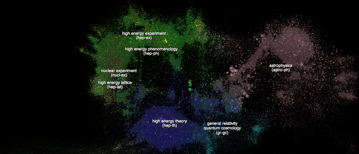
Paperscape is a visualization of nearly 900,000 scientific papers housed in the online research repository ArXiv. The papers are represented as circles, colored according to their subject area and sized according to the number of other papers that cite them. The layout of the visualization is controlled by physics: each paper is repelled from every other using a simulated inverse-gravitational force and attracted toward all its references by a simulated spring. Users can also see the relative age of each paper and get a sense of the most active areas of research that are housed on the repository. For example, work that tests or challenges the standard model of particle physics (such as CERN’s 2012 papers on the detection of the Higgs boson) shows up especially brightly.
The visualization was created by Damien George, a researcher at the Cambridge Department of Applied Mathematics and Theoretical Physics, and Rob Knegjens, a PhD candidate in theoretical physics at the Dutch national institute for particle physics.

