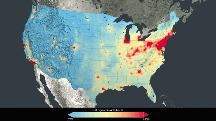
NASA’s Goddard Space Flight Center has released a series of visualizations showing how air pollution levels have decreased across the country in recent years. The visualizations show nitrogen dioxide concentrations mapped from 2005-2011. Even on that short time scale, a significant improvement is apparent: Rust Belt states saw a dramatic decrease in pollution levels, as did cities like Atlanta and Phoenix. Pockets of pollution remain in familiar places. Los Angeles, Chicago, and the New York City metropolitan area are still among the most polluted places in the country. Still, even New York reduced its nitrogen dioxide levels by 32 percent from 2005 to 2011.

